

How to Build a Flutter Navigation Drawer (Hamburger Menu)


Navigation drawer is a typical UI pattern for adaptive menus. The Material Design documentation formalizes the menu's behavior, but this pattern is not peculiar to Material Design. The pattern includes a basic Hamburger menu but isn't limited to small screens. The menu pattern suits all screen sizes. On larger width screens, you see the icon and text, smaller screens will display icons only, and on phones, the menu will disappear during regular use and slide in with the hamburger icon.
Follow me on Twitter for updates to this example.
Watch how the menu adapts to screen size changes on a desktop screen. It behaves the same way on phones and other form factors. Check out the complete example in the repo, or see the example code here. This example is a work in progress, and the long-term aim is to implement the material design pattern as closely as possible.

If you're looking for a simple menu drawer example that isn't adaptive, please check out this article.
NavigationDrawerMenu
This is a widget that functions like a ListView. However, it exists to remove some of the boilerplate code necessary for constructing the menu and allows you to put arbitrary-sized spacers and headings inside the menu. The example uses this set of definitions. If you don't want to use this widget, you can use ListView instead. Add this package from pub dev, or see the code here.
final menuItems = [
  MenuItemContent(
      MenuItemDefinition("Alarm", alarmValueKey, iconData: Icons.access_alarm)),
  MenuItemContent(MenuItemDefinition("Todo", todoValueKey,
      iconData: Icons.ad_units_rounded)),
  MenuItemContent.widget(const SizedBox(
    height: 30,
  )),
  MenuItemContent(MenuItemDefinition("Photo", photoValueKey,
      iconData: Icons.add_a_photo_outlined))
];
How Does the Adaptive Layout Work?
On build, the widget checks the screen's width with a MediaQuery. It divides the screen into three width sizes: Drawer (only menu drawer), Thin menu, or Thick Menu. When we view on desktop landscape, we will see the full menu, but you can also toggle it to thin. If the user shrinks the width of the window, the menu will become thin. This is how to check:
extension on BuildContext {
  MenuMode getMenuMode(bool isThin) {
    final width = MediaQuery.of(this).size.width;
    if (width > minimumWidthForThickMenu) {
      return !isThin ? MenuMode.Thick : MenuMode.Thin;
    }
    if (width <= minimumWidthForMenu) {
      return MenuMode.Drawer;
    }
    return MenuMode.Thin;
  }
}
In Drawer mode, toggleDrawer causes the drawer to open or close with an animation. Phones will always have a small width and use Drawer only mode.
void toggleDrawer(MenuMode menuMode) {
  if (menuMode != MenuMode.Drawer) {
    setState(() {});
  } else {
    if (_scaffoldKey.currentState!.isDrawerOpen) {
      _scaffoldKey.currentState!.openEndDrawer();
    } else {
      _scaffoldKey.currentState!.openDrawer();
    }
  }
}
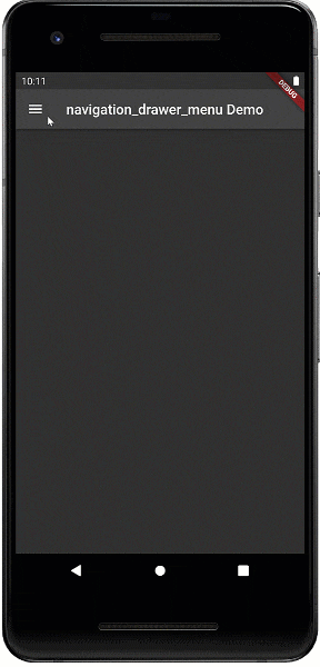
Here is the Android menu
Lastly, this is the code that dynamically builds the menu. It hides the text when the user is in Thin menu mode.
NavigationDrawerMenu getMenu(BuildContext context) => NavigationDrawerMenu(
    getHighlightColor: () => Theme.of(context).indicatorColor,
    onSelectionChanged: (key) => toggleDrawer(context.getMenuMode(isThin)),
    menuItemContentList: ValueNotifier(menuItems),
    selectedMenuKey: valueNotifier,
    itemHeight: 60,
    itemPadding: const EdgeInsets.only(left: 5, right: 5),
    buildMenuButtonContent: (mbd, isSelected, bc) => Row(
        mainAxisAlignment: MainAxisAlignment.center,
        children: context.getMenuMode(isThin) != MenuMode.Thin
            ? [
                getIcon(mbd, isSelected, bc),
                const SizedBox(
                  width: 10,
                ),
                Text(mbd.text,
                    style: isSelected
                        ? Theme.of(context)
                            .textTheme
                            .bodyText2!
                            .copyWith(color: Theme.of(bc).backgroundColor)
                        : Theme.of(bc).textTheme.bodyText2)
              ]
            : [getIcon(mbd, isSelected, bc)]));

Icon getIcon(MenuItemDefinition mbd, bool isSelected, BuildContext bc) =>
    Icon(mbd.iconData,
        color: isSelected
            ? Theme.of(bc).backgroundColor
            : Theme.of(bc).textTheme.bodyText2!.color);
Wrap-Up
Flutter started out as a phone-only UI Toolkit, but adaptive layouts are becoming more important. When working with designers you should collect two or three versions of each screen for different form factors. If you are careful, you can usually make the code adaptive so that the screen matches each of the design form factors.